Hopp by Wix
Product Design
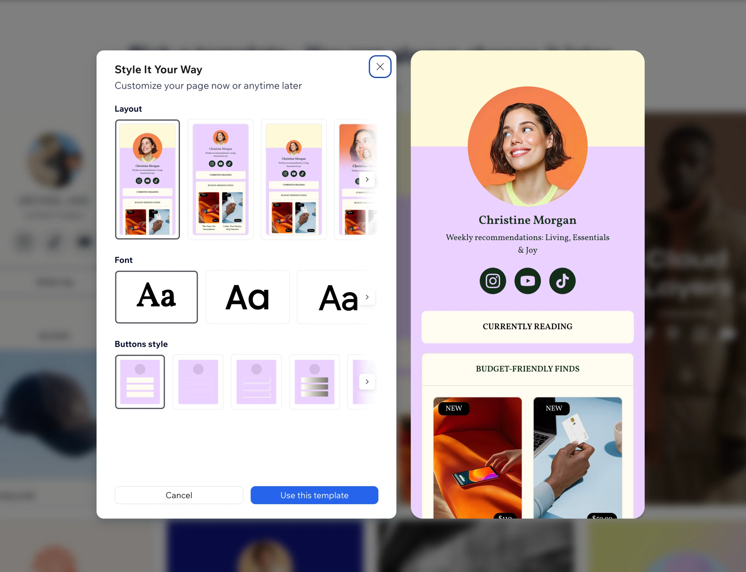
Hopp is Wix’s link-in-bio tool, designed to help creators and small businesses build personalized, well-designed pages quickly and easily.
Being a Product Designer on Hopp taught me to move between product thinking and visual design - improving the experience of building a page while also shaping what users could create with it. I worked on making the product clearer and easier to use, expanding its design possibilities without overwhelming users, and designing a wide range of templates for different creators, businesses, and needs. I also explored new ways to create visual content with AI tools.
Being a Product Designer on Hopp taught me to move between product thinking and visual design - improving the experience of building a page while also shaping what users could create with it. I worked on making the product clearer and easier to use, expanding its design possibilities without overwhelming users, and designing a wide range of templates for different creators, businesses, and needs. I also explored new ways to create visual content with AI tools.
Add Blocks Panel
Redesign & Illustration System
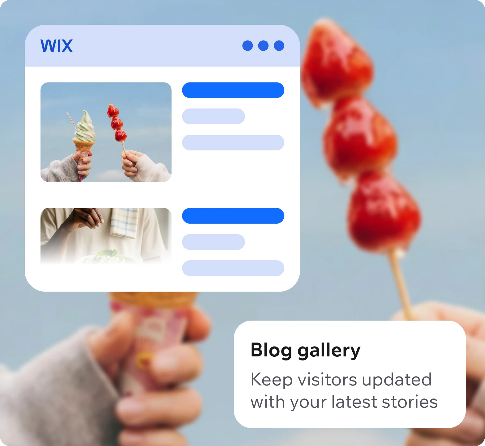
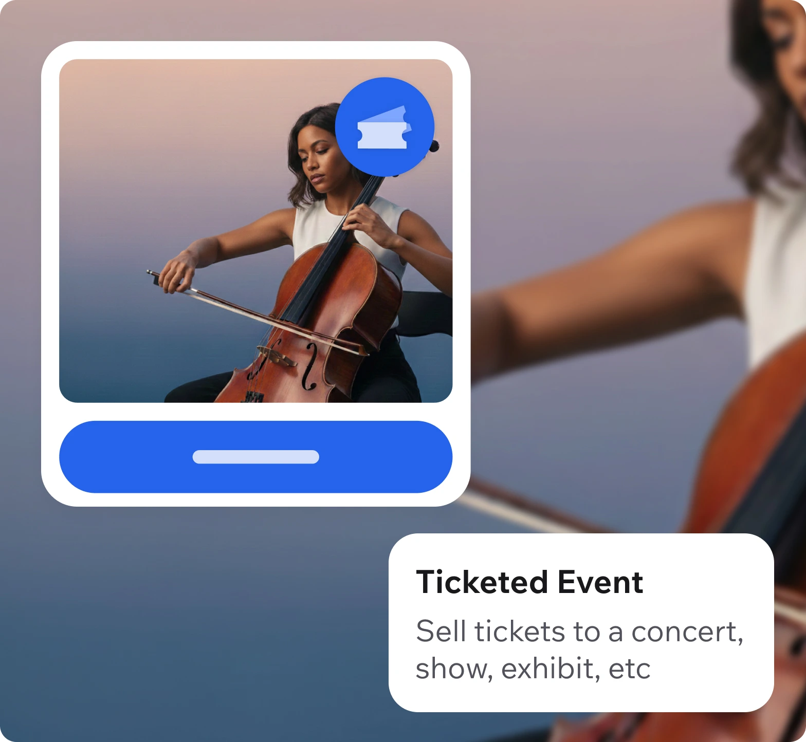
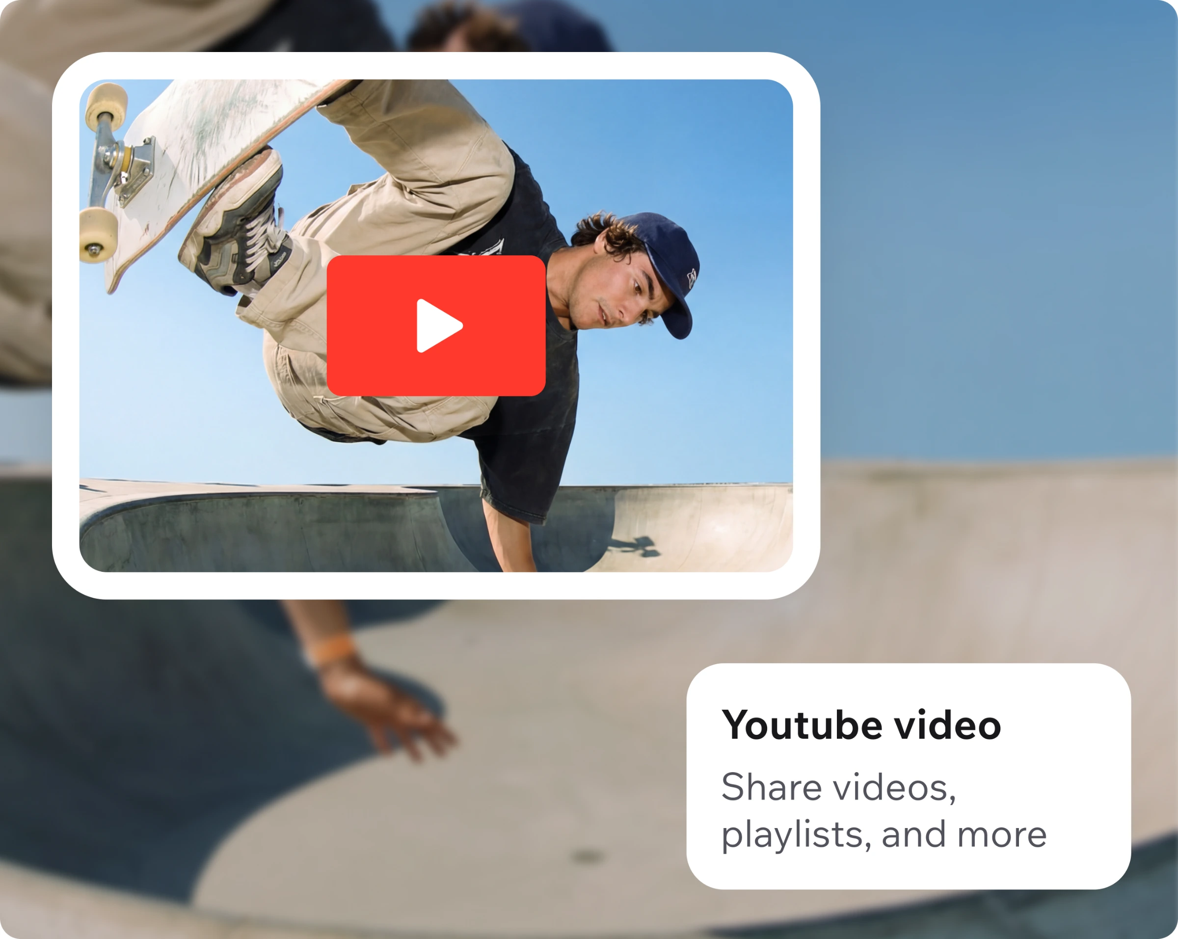
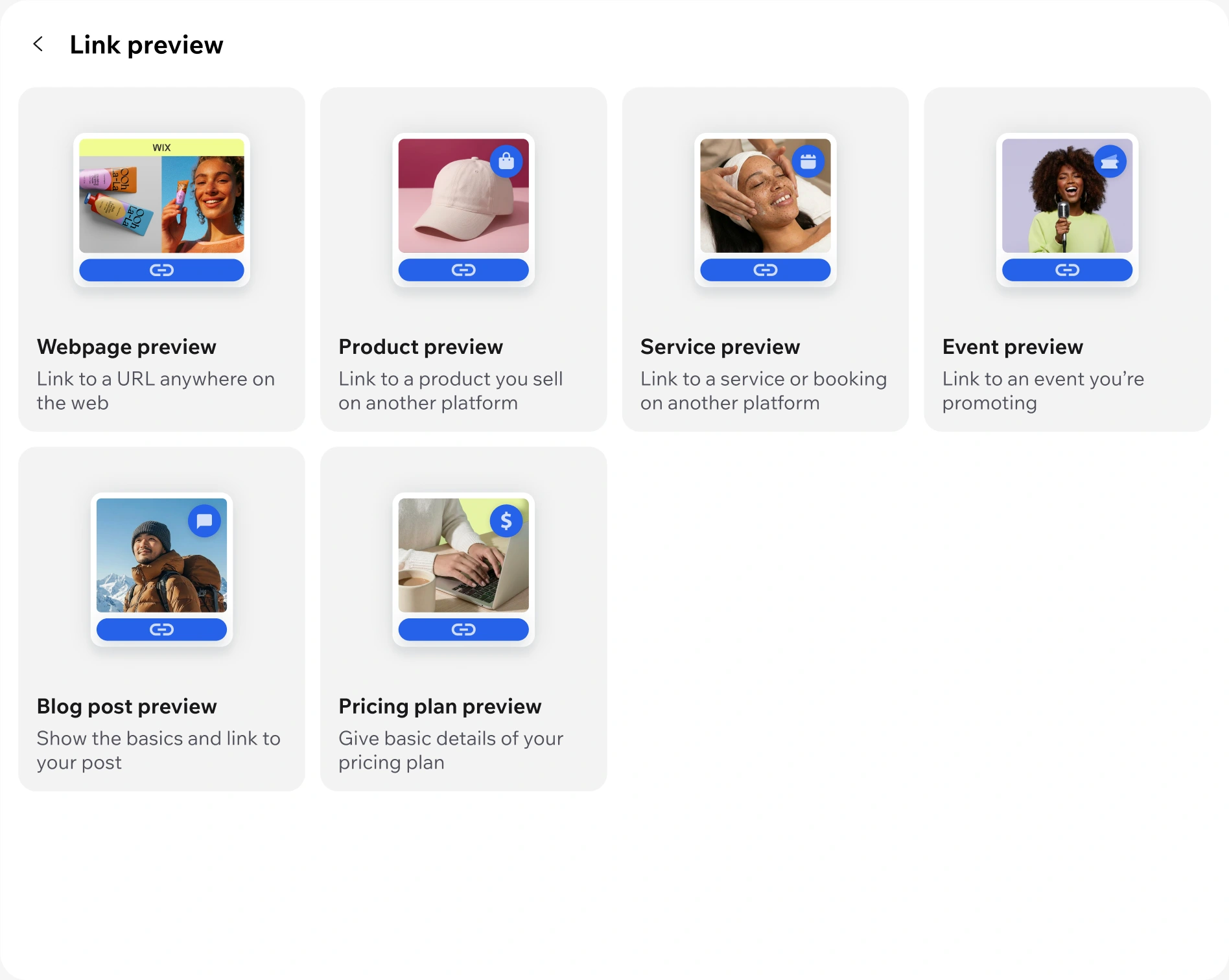
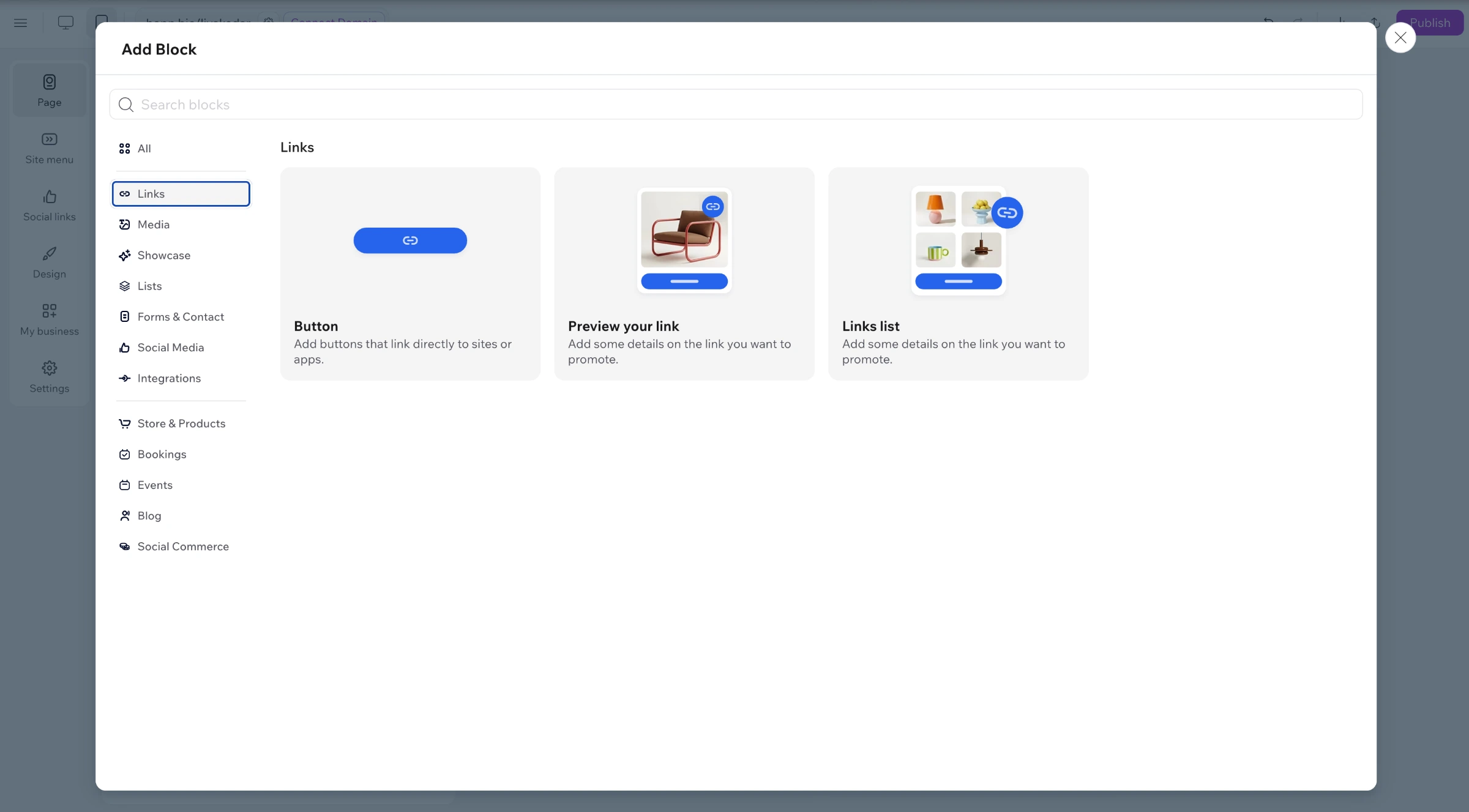
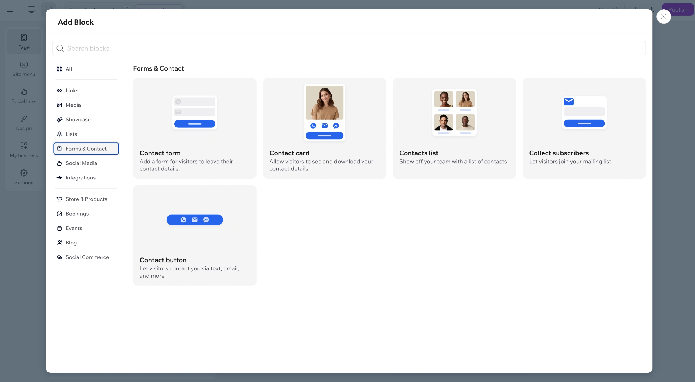
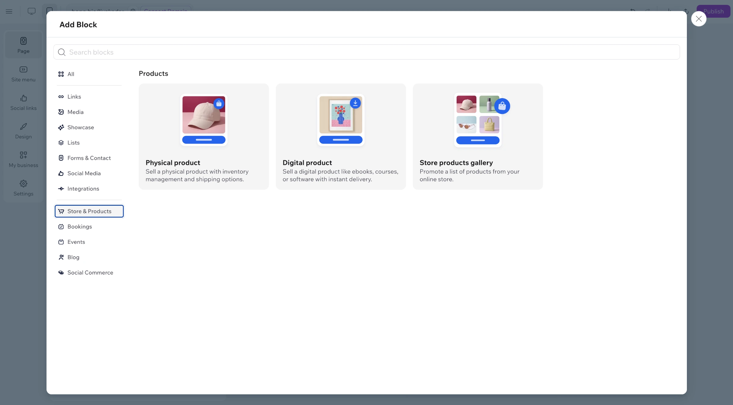
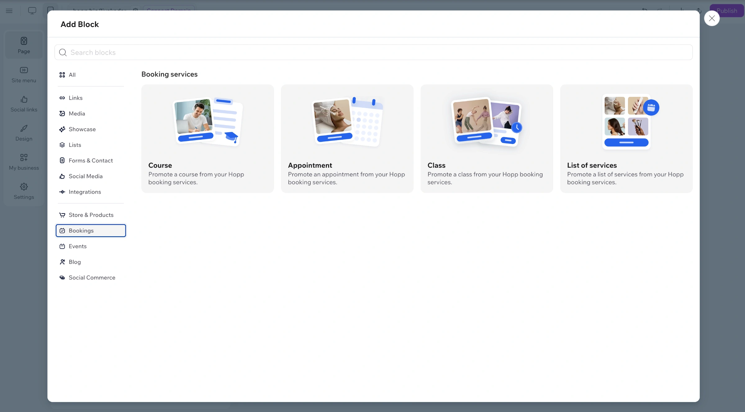
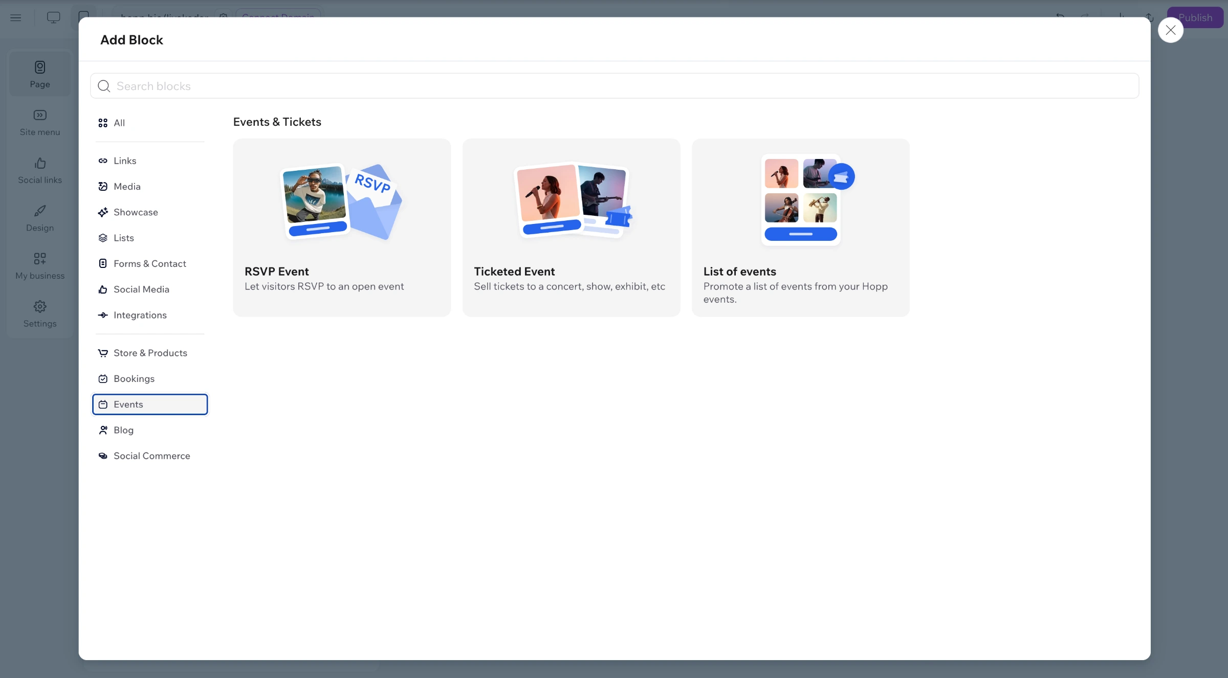
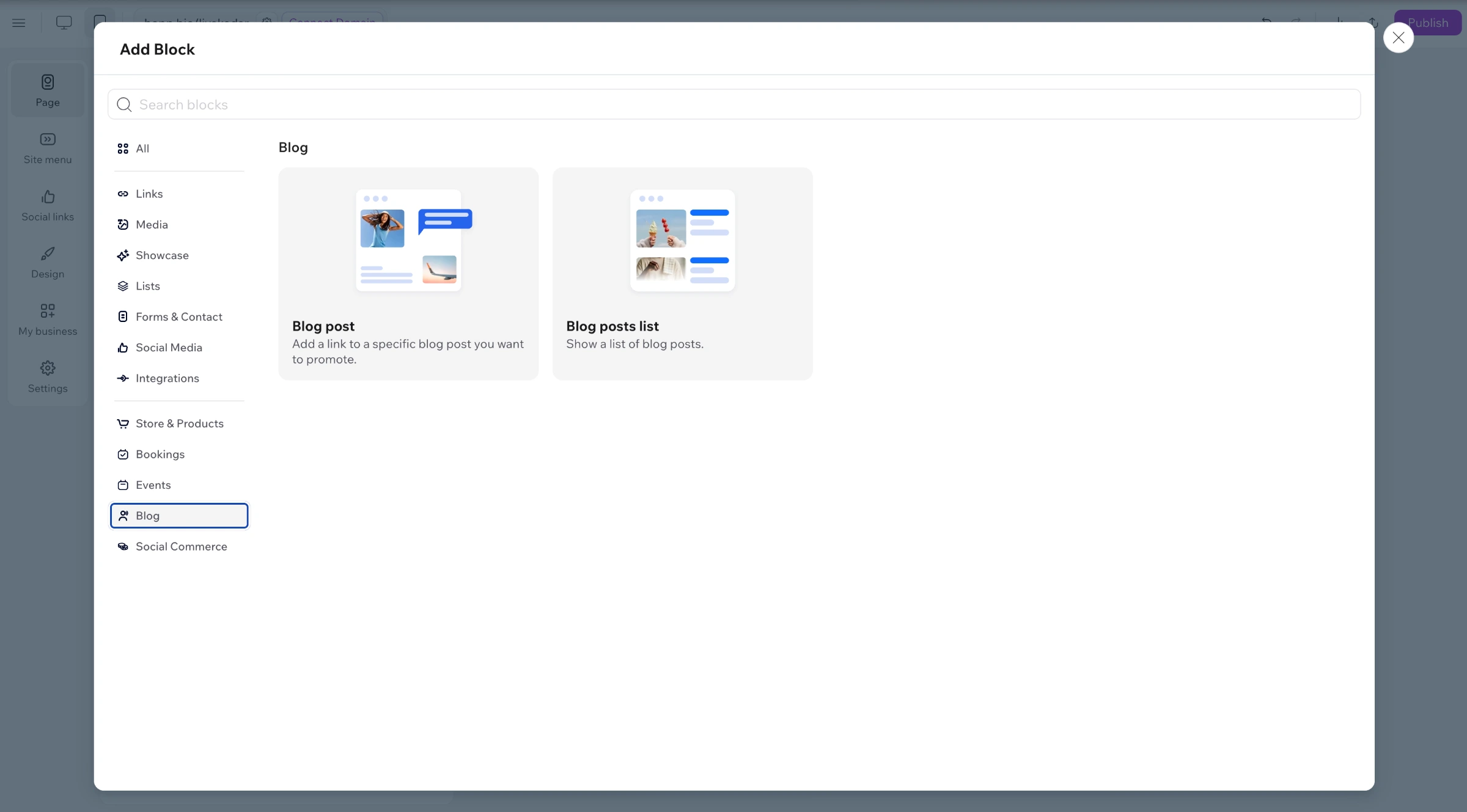
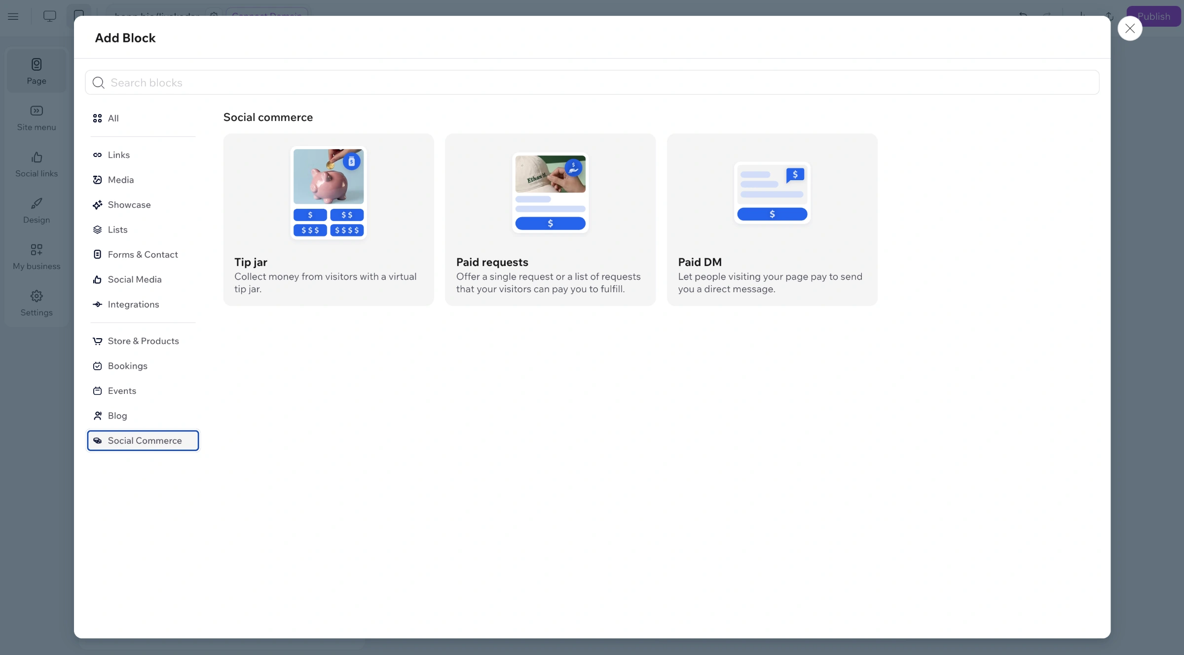
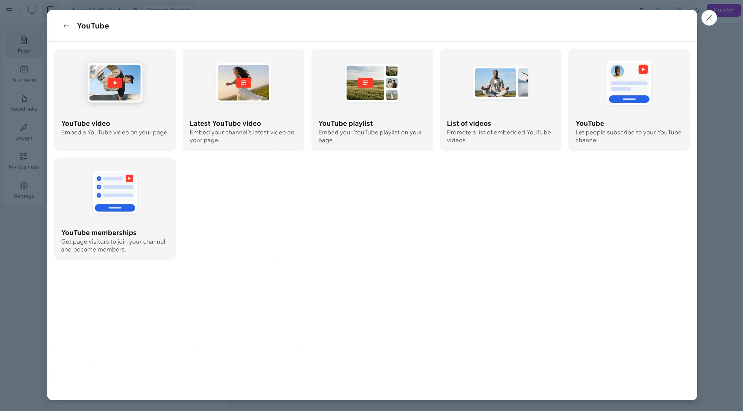
This project focused on redesigning the “Add Blocks” panel to improve clarity, usability, and visual organization. The goal was to create a more intuitive and accessible experience when adding new blocks. The redesign included restructuring the layout and creating over 200 custom illustrations to visually represent each block, making the system clearer, more friendly, and easier to navigate.
01 - The Challenge
The original Add Blocks panel wasn’t clear enough. The illustrations didn’t always communicate what each block actually did, while the amount of visual information created unnecessary noise and confusion.
With over 200 blocks, many of them closely related, it was important to create clear distinctions between them. How do you distinguish a physical product block from a digital one? Or a booking block for a class, a course, or an appointment?
With over 200 blocks, many of them closely related, it was important to create clear distinctions between them. How do you distinguish a physical product block from a digital one? Or a booking block for a class, a course, or an appointment?
02 - The Vision
Make adding a new block feel simple and intuitive - creating a clear, coherent visual system that users could understand within seconds.
Similar blocks needed to feel like part of the same family, while each block still had to be recognizable on its own.
Similar blocks needed to feel like part of the same family, while each block still had to be recognizable on its own.
03 - The Solution
I redesigned the structure of the Add Blocks panel and created over 200 custom illustrations, developing a visual language that connects related blocks while giving each one its own recognizable identity.
The result is a cleaner, friendlier system that makes it easier to scan, understand, and navigate between blocks.
The result is a cleaner, friendlier system that makes it easier to scan, understand, and navigate between blocks.
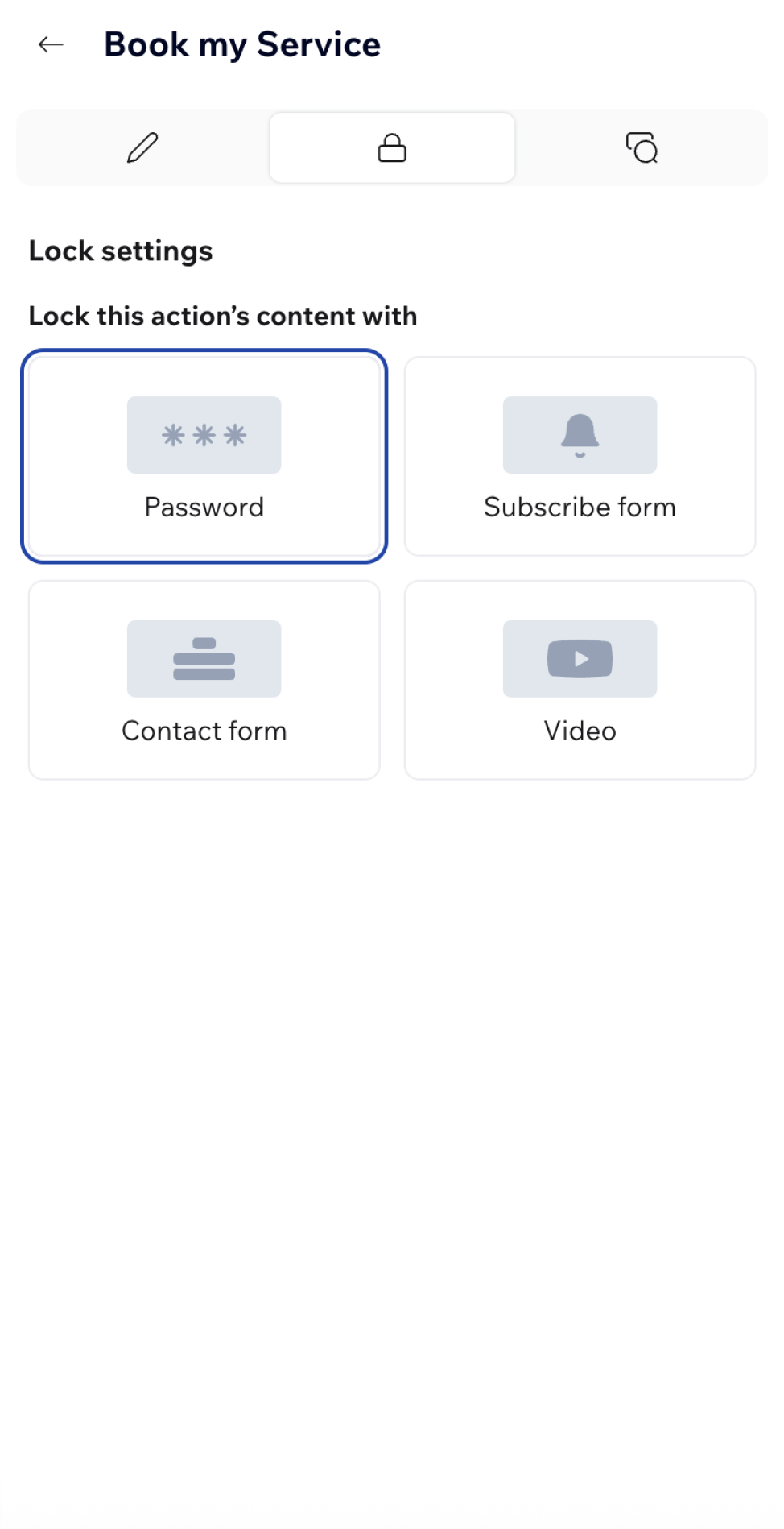
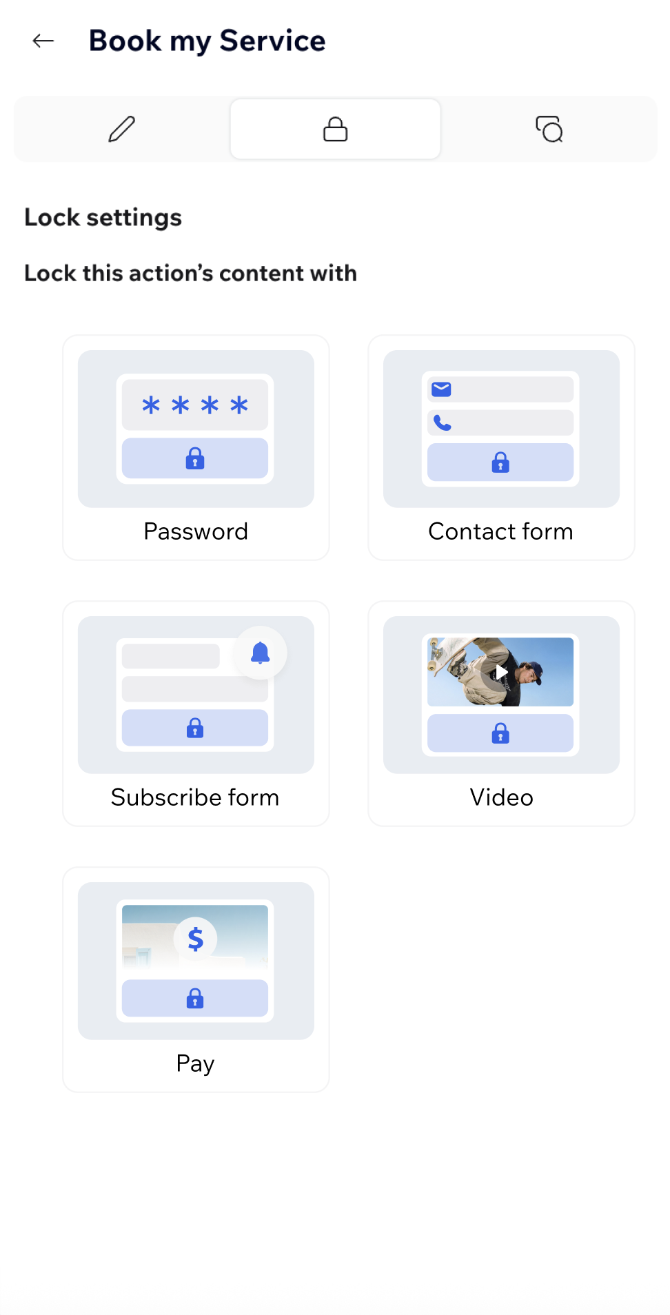
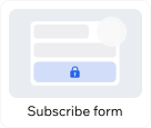
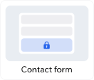
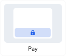
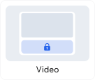
Lock Panel
Redesign & illustrations
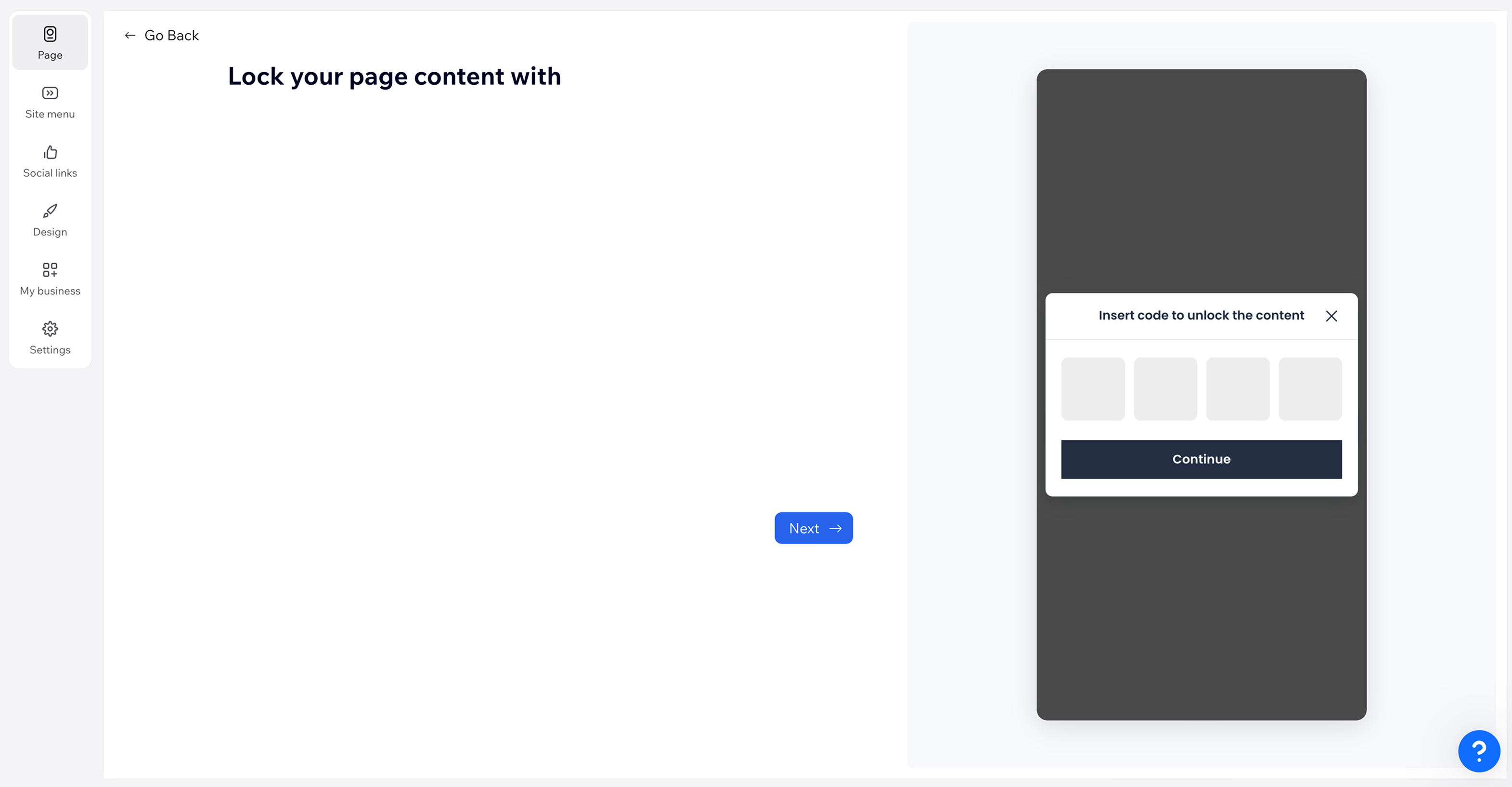
The Lock Panel allows users to control access to their content by choosing how visitors can unlock it. I redesigned the experience to make the available options clearer, more consistent, and easier to scan.
Visual Content
Image Making & Default Content
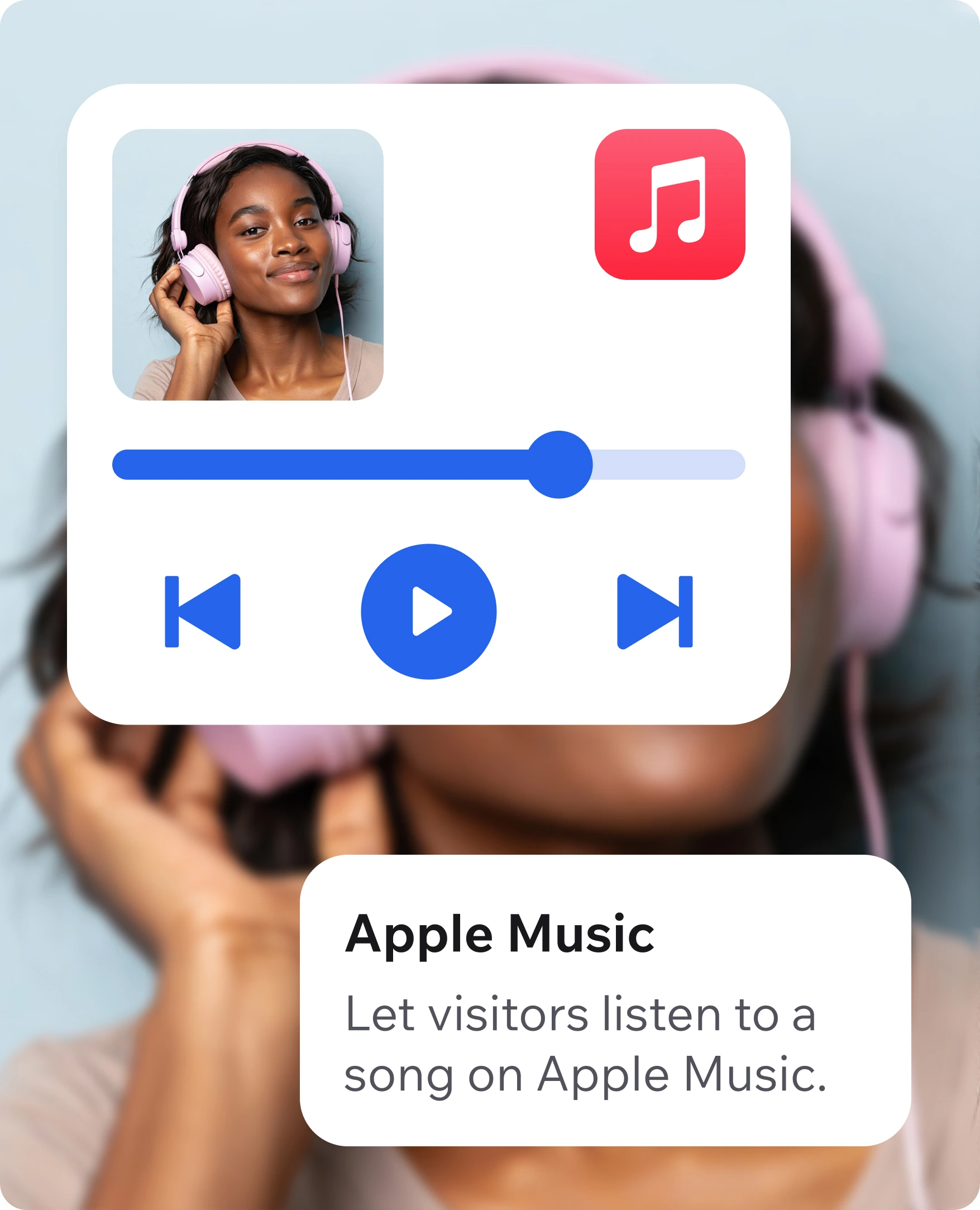
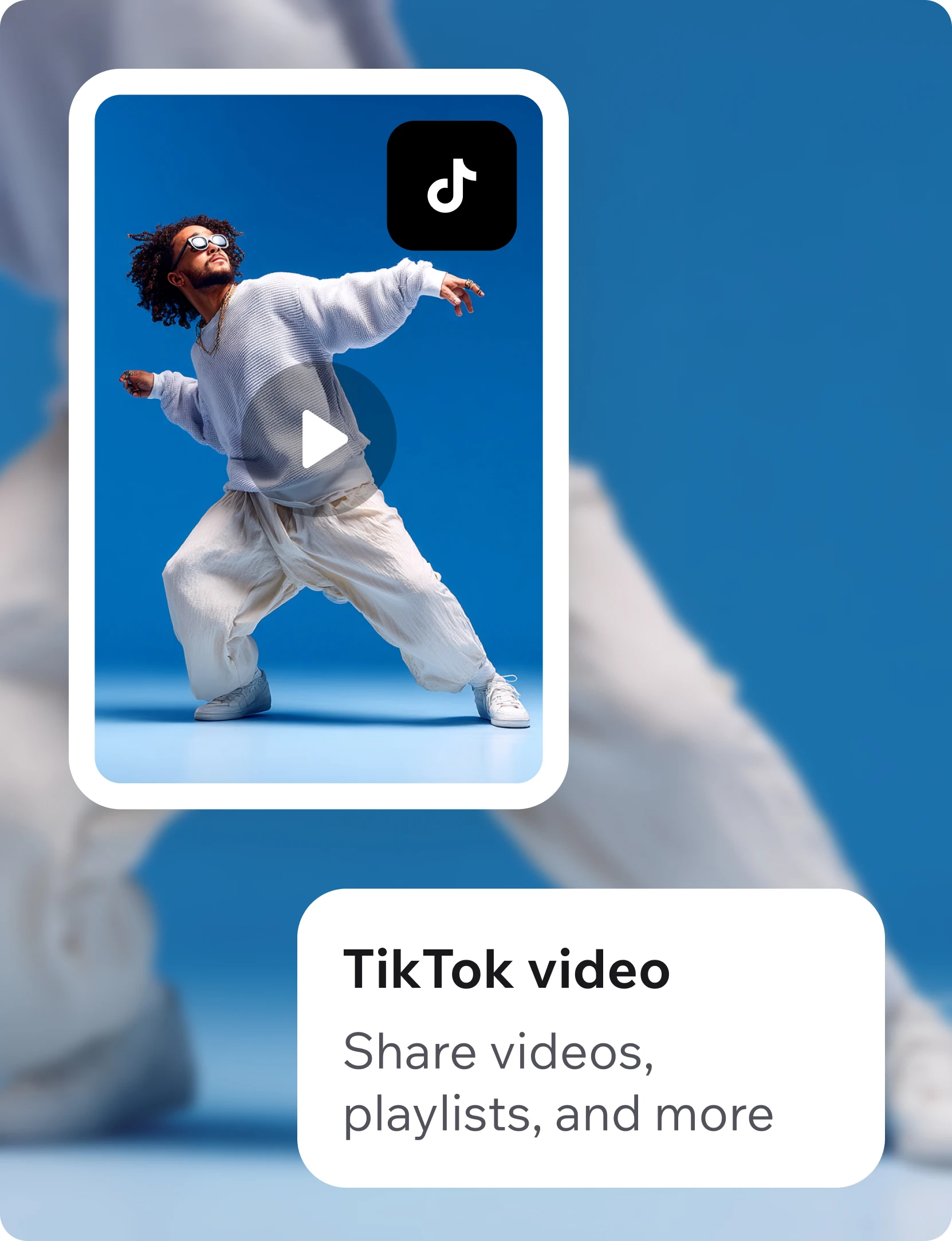
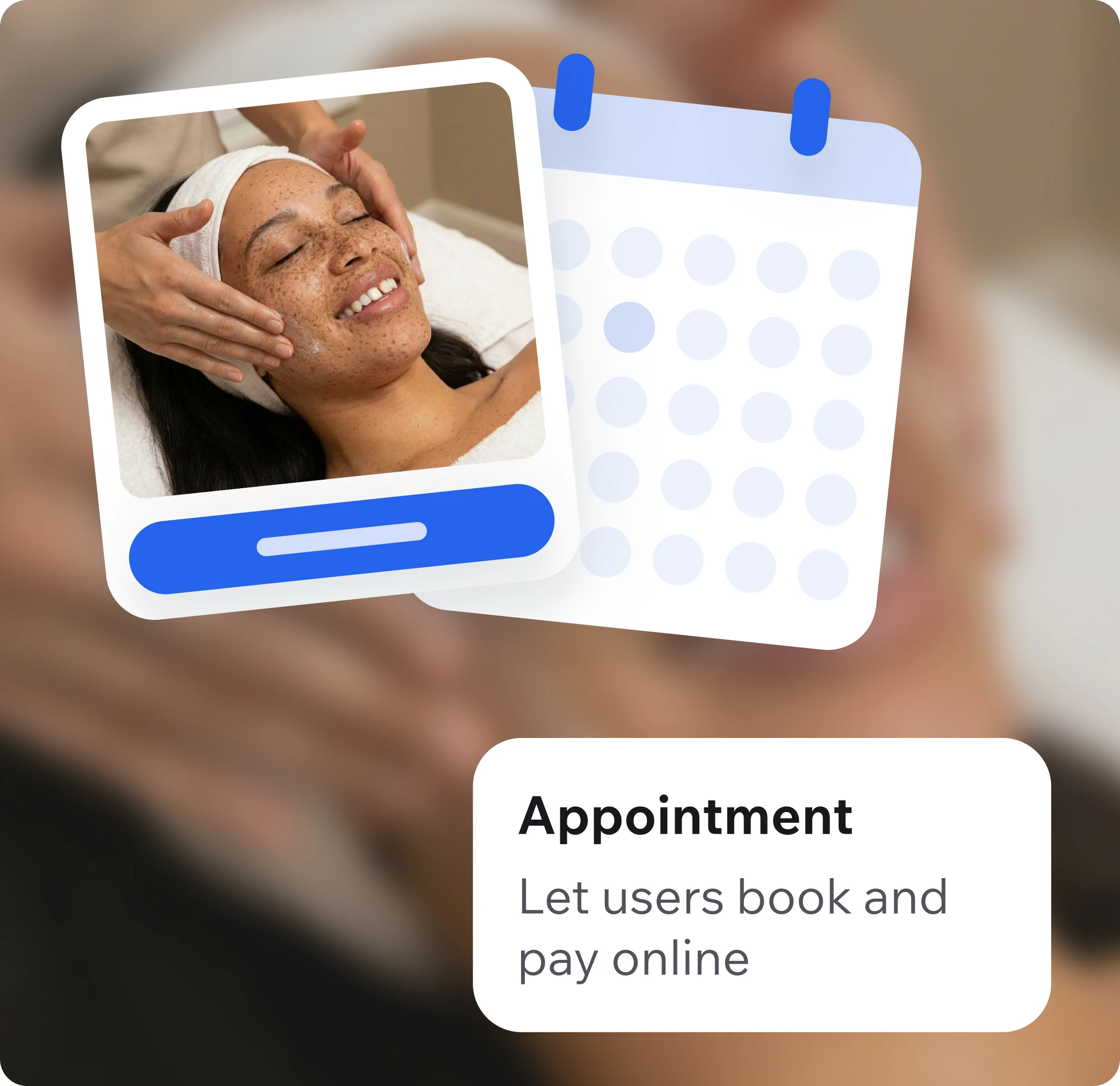
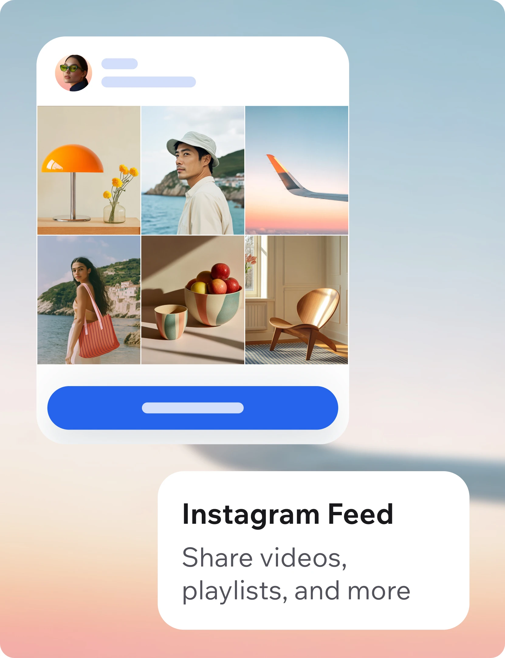
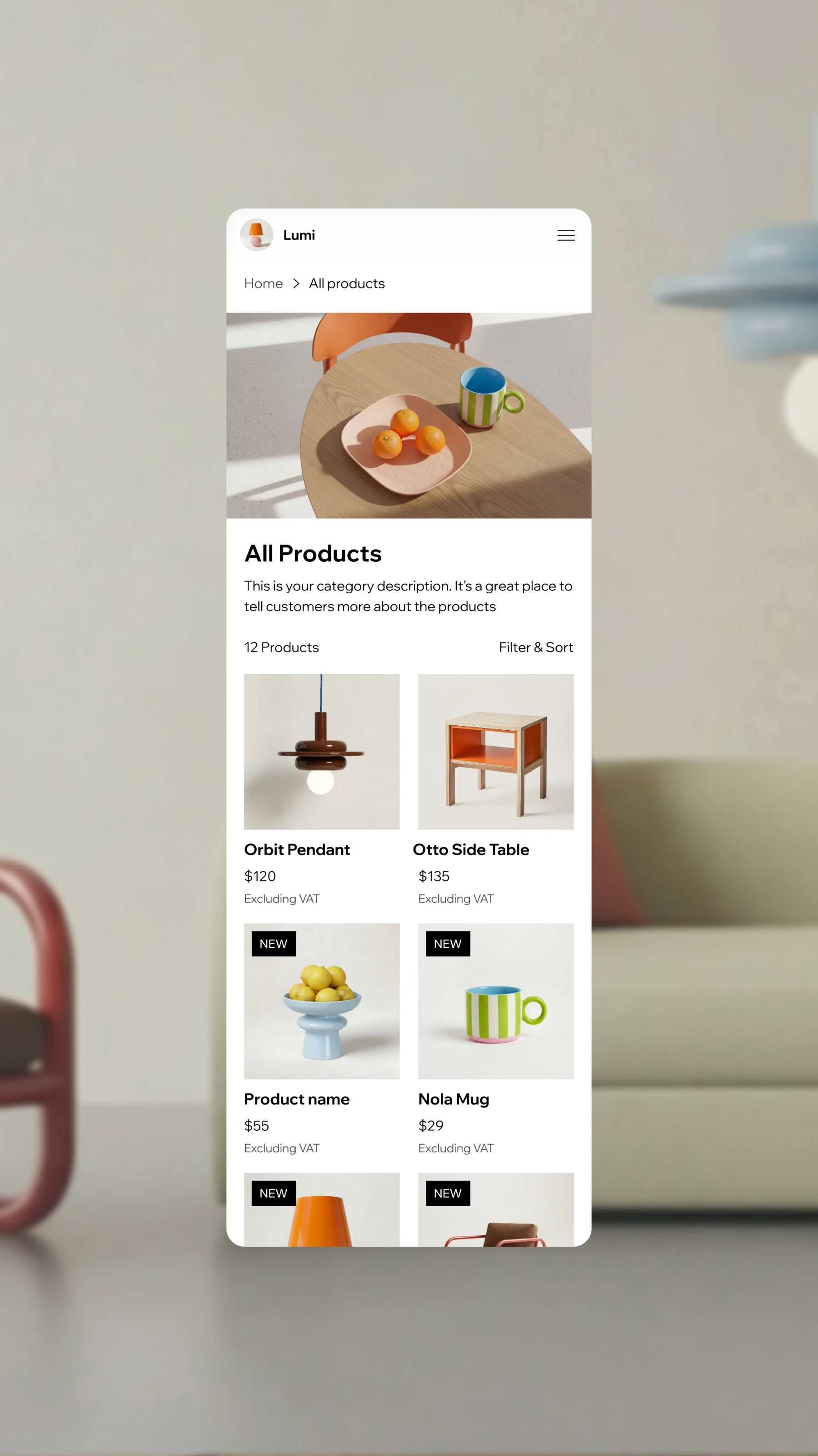
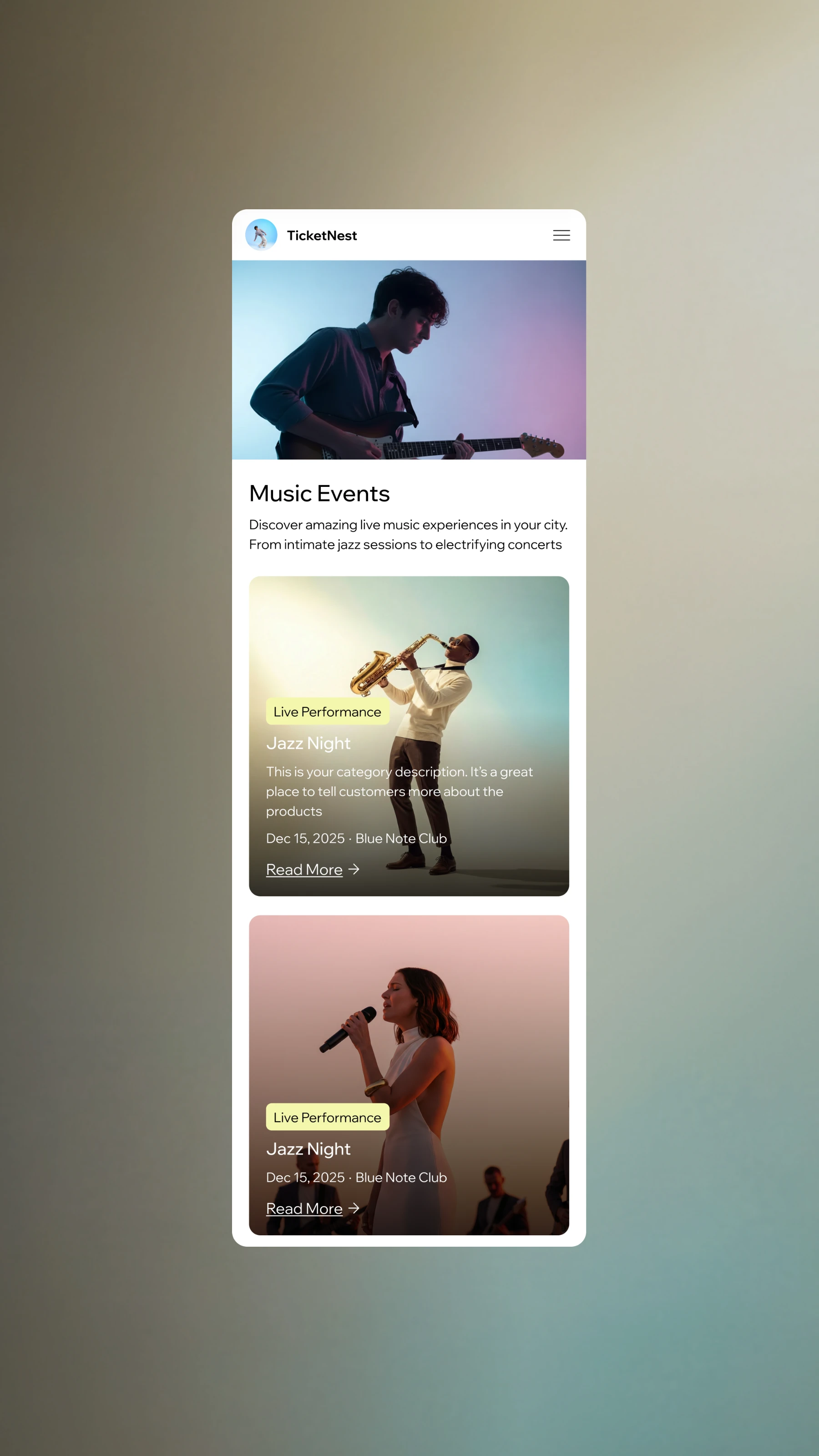
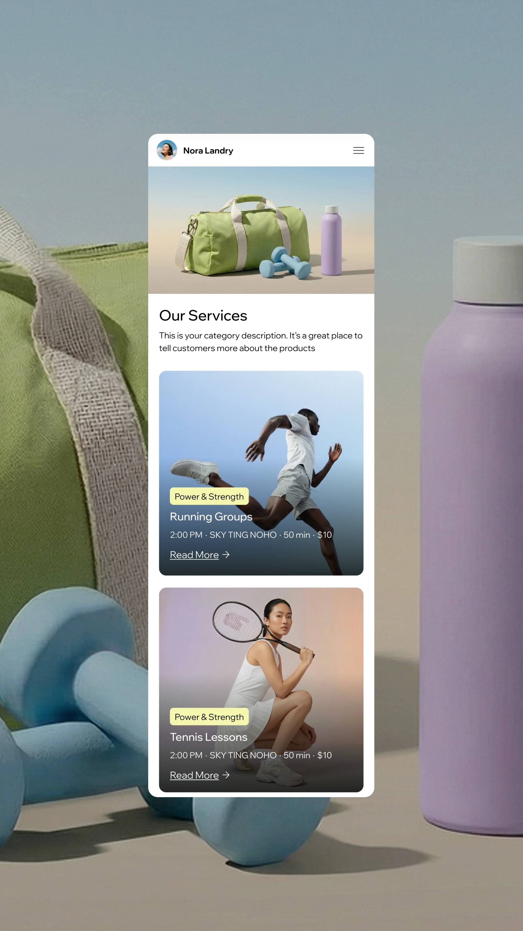
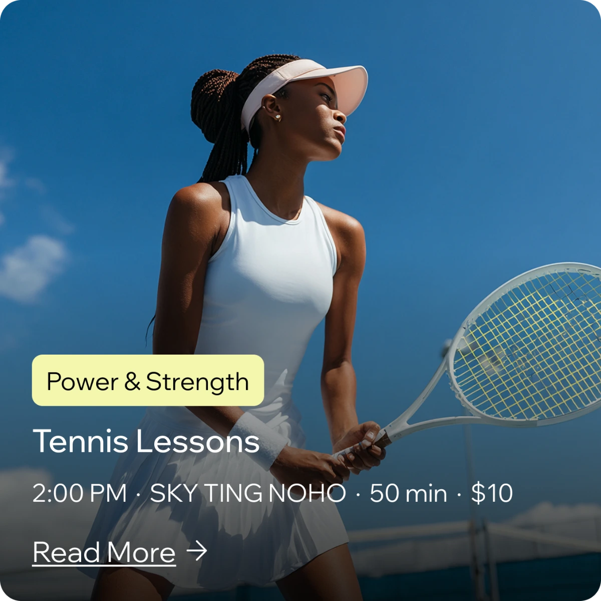
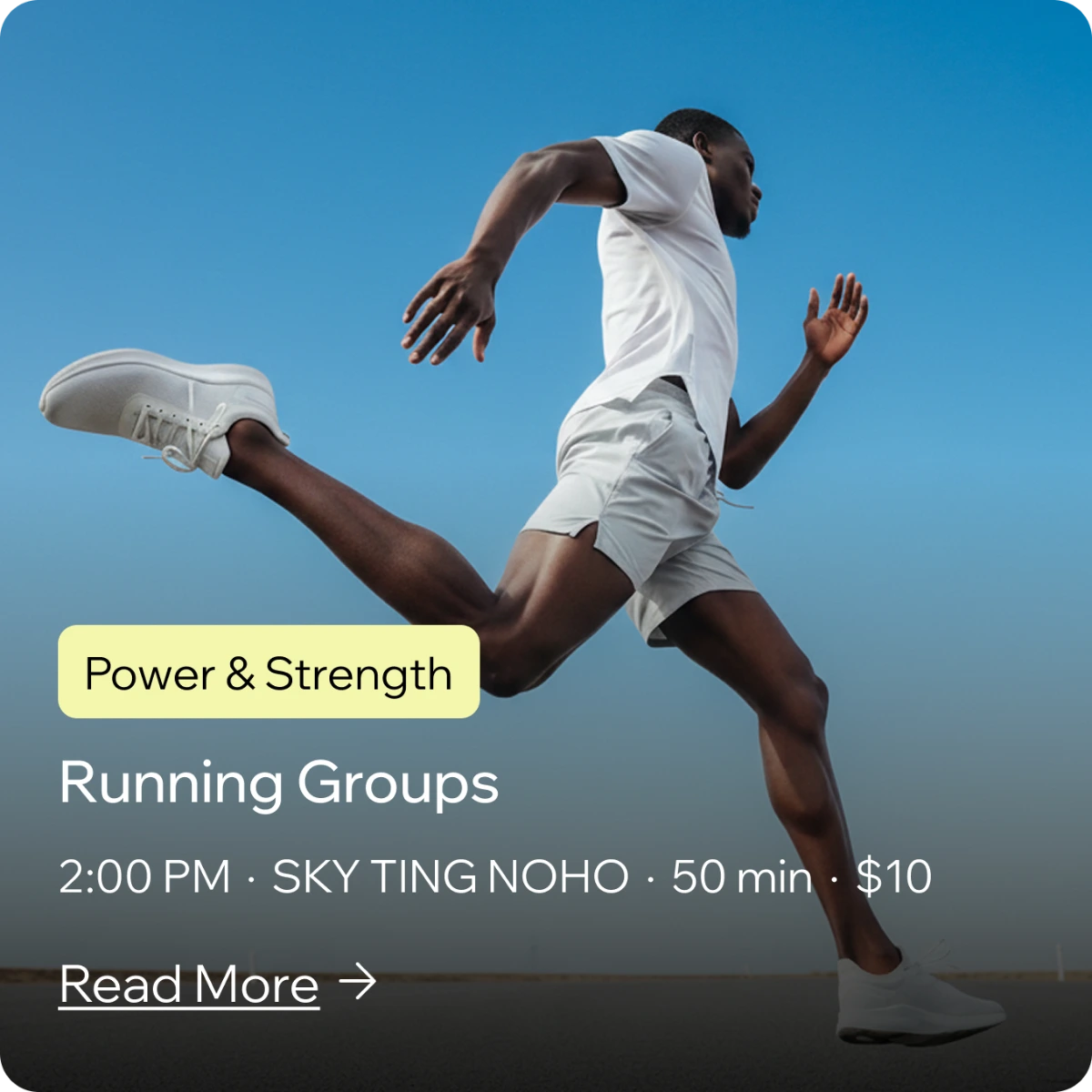
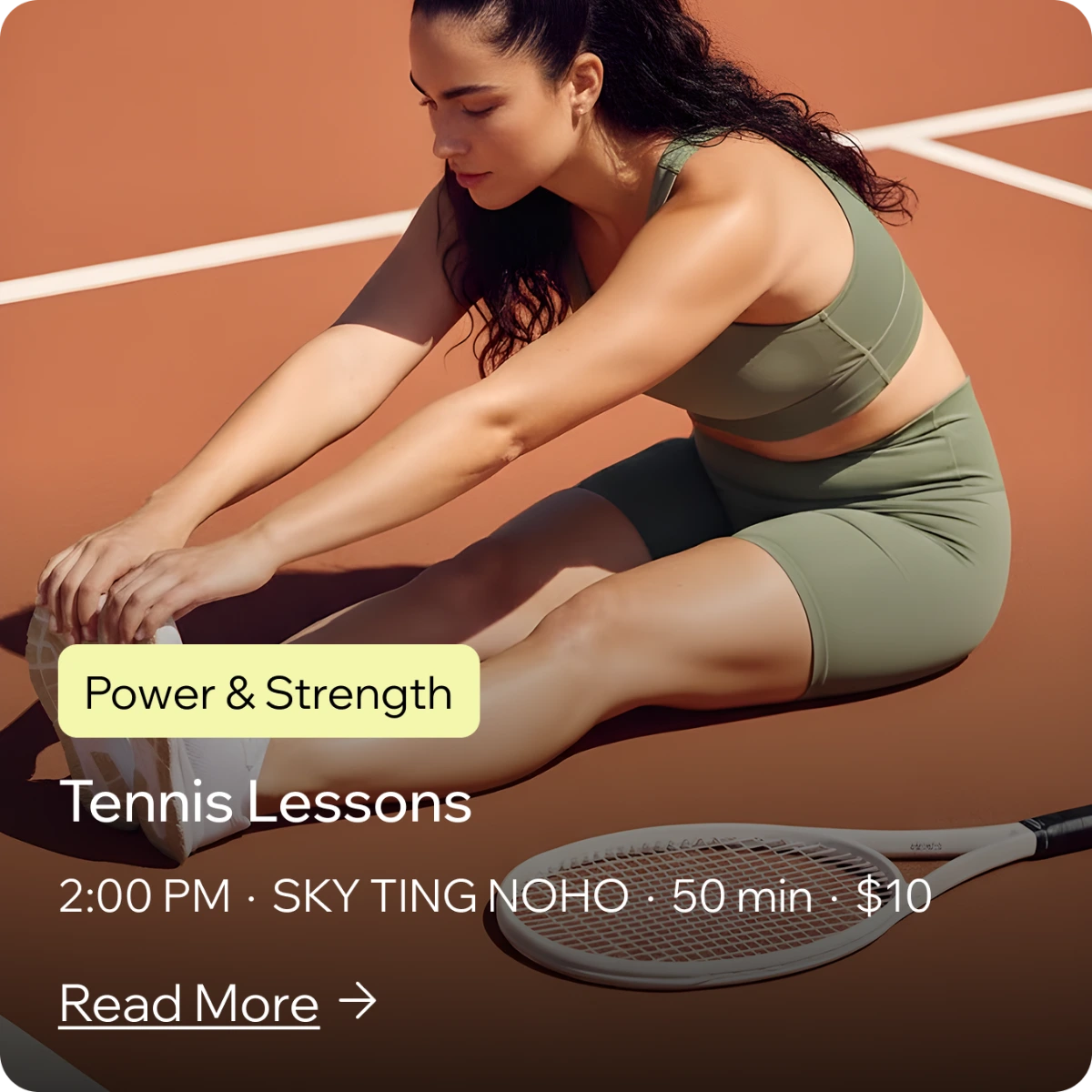
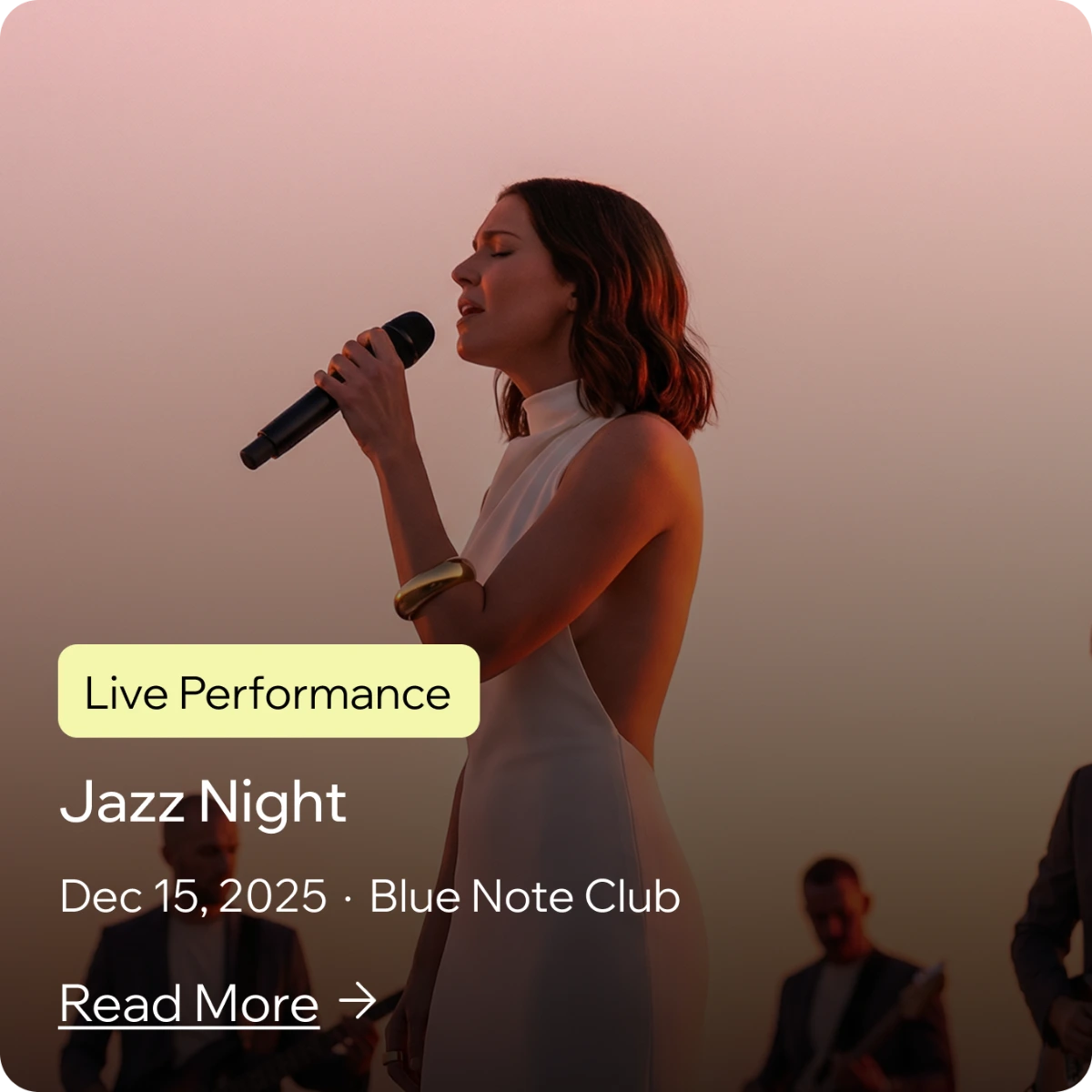
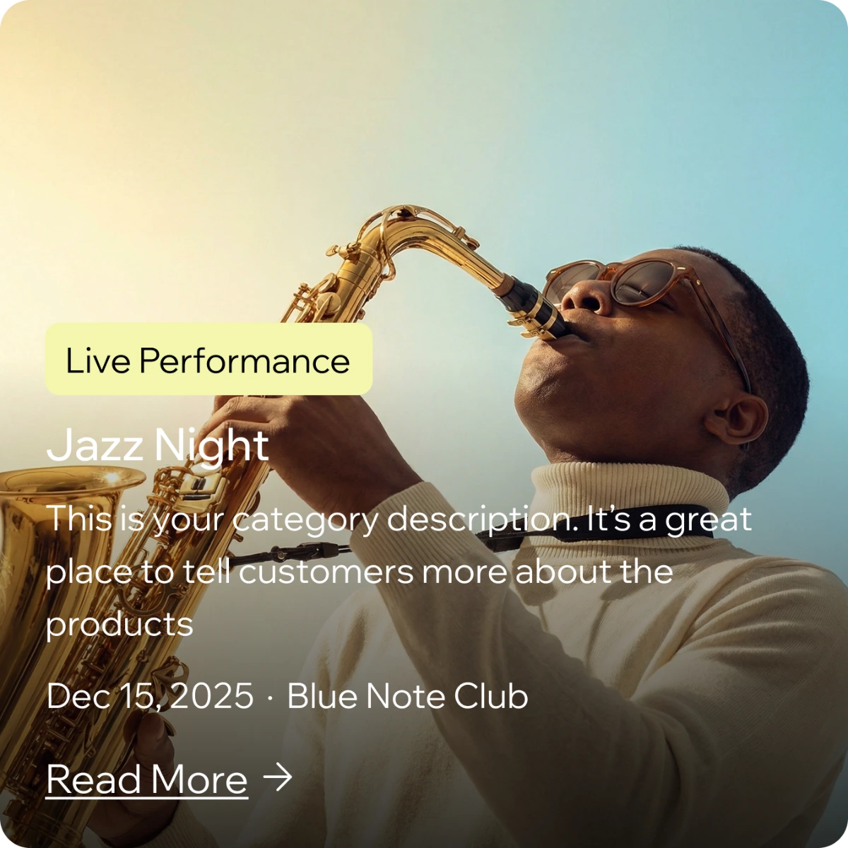
Alongside product design, I used AI tools like Weavy and Midjourney to create default content and imagery for Hopp.

Before
After


{{ frameLabel }}